Preliminary Task Mood Board
|
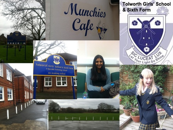
For my mood board, I have taken and gathered photographs which link to my preliminary task of making a magazine for either my school or sixth form. I have been able to walk around the premises of the school, taking a series of photographs which I could use within my magazine's front cover. I have taken images of relevant and important places which I believe will go well with the genre and theme of my magazine. This included Munchies the school canteen, the school building as well as the school field. I have also gathered an image of the school's logo and an image of a student from both the school and sixth form.
|
|
Brainstorm
|
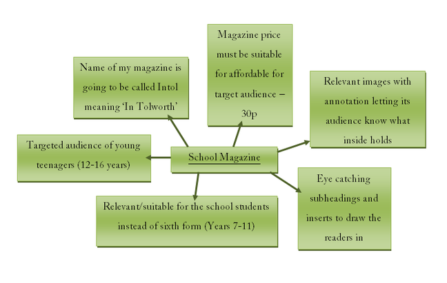
To help create my front cover to the magazine targeted at the students at Tolworth Girls' School I must brainstorm factors in which I must follow when creating my magazine front cover making sure everything is suitable and relevant to the genre of the magazine and my target audience. This includes the name of the magazine, encouraging it to be relevant to it's reason of selling, the price must be suitable for its target audience, and all the inserts of information and images included must be relevant and suitable for the genre and target audience.
|
|
Preliminary Task Magazine Front Cover
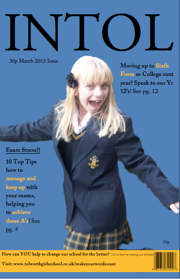
For our preliminary task, we had to create a mock up version of a magazine front cover, contents page and double page spread targeted at either students of the school of sixth formers from the Tolworth Girls' Sixth Form. We had to base our magazine on either the school or the sixth form so that the information included was relevant and suitable for the right age groups. For my magazine, I chose to target it at the school students which includes all years from year 7 - 11. This encouraged me to base my information included on my magazine, suitable and appropriate for the ages of 12-16 years old. It will include information about helping with exams, moving on up after school to sixth form or college and how we can help to change the school for the better. For the masthead of my magazine, I have named it 'INTOL' suggesting that it is target at those who are either 'In Tolworth' or are part of the community. For my main image on the front cover I have used a medium close up of an image which I have taken myself of a student from the lower part of the school featuring our school uniform. I have also included the date and the price on the magazine to clearly highlight the issue and how much the magazine will cost to buy. This has been highlighted twice, with it being written at the top of the magazine and also at the bottom above the barcode.
The colours I have used for my magazine are Tolworth Girls' traditional colours due to the colour of our school uniform. I have used a pale blue as my background, with the text being divided into both black and yellow, with yellow highlighting the important information. The masthead has been written in a large font, in a bold black colour with an easy font encouraging it to stand out from the rest of the page. The magazine links well to its theme and target audience, holding suitable information and imagery which clearly shows its chosen age range. I have also created a mock up version of my front cover, including where my masthead, image, text and the other main features of a front cover of a magazine go.
The colours I have used for my magazine are Tolworth Girls' traditional colours due to the colour of our school uniform. I have used a pale blue as my background, with the text being divided into both black and yellow, with yellow highlighting the important information. The masthead has been written in a large font, in a bold black colour with an easy font encouraging it to stand out from the rest of the page. The magazine links well to its theme and target audience, holding suitable information and imagery which clearly shows its chosen age range. I have also created a mock up version of my front cover, including where my masthead, image, text and the other main features of a front cover of a magazine go.
|
|
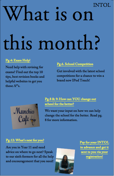
Preliminary Task Magazine Contents Page
For my contents page I have created a basic and easily read page, which highlights some of the important pages in which the magazine's target audience may be interested in reading. The contents page is created incase the reader is interested in a certain page and may wish to skip pages to go to a page in which they want to read first. Following the same layout and colour scheme as my front cover, I have used the same font and colour as the magazine's masthead 'INTOL' for the tittle for the contents page which is shown clearly at the top of the page saying 'What is on this month?'. I have then highlighted the most important and popular pages, which the readers may be interested in reading first. I have done this by highlighting the page number and title in yellow and then have written a small sentence below telling the reader what the page contains. I have also included some images on my contents page which I collected for my mood board. The images are relevant to the text and the whole of the magazine (relevant to the school). The pictures included show 'Munchies' the school canteen, and a sixth form student. I have also written 'INTOL' at the top of the page, which would be repeated throughout the magazine, on each page to remind the reader of the magazine masthead. At the bottom of the page, I have also written about getting a subscription to the magazine, allowing them to receive the magazine via their registration instead of them having to come and buy/collect it their selves. Again, I have also created a mock up version of my contents page, which shows a plan of my contents page, including where the masthead, images and text should go.
|
|
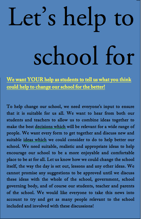
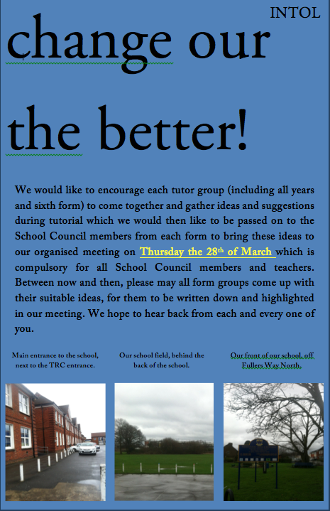
Preliminary Task Magazine Double Page Spread
For my double page spread, I have written about how the students and teaches reading the magazine are able to get a chance to help to change the school for the better and asking them for their ideas. The page's header is 'Let's help to change our school for the better!' which is large enough to catch the readers eye and draw them into the article. The header and text is again following the layout of all the other pages of the magazine and the front cover, helping it to keep a simple and easy read layout. The header is written in a large bold black font which takes up a great deal of the page, suggesting that it will be definitely noticeable compared to . I have then written a subheading, which just briefs the heading of the page in a little more detail which then allows the reader to go on and read the article knowing a little more about the article. In the same font as the subheading I have also highlighted an important date which is relevant to the article, so that it stands out and clearly reminds the reader. At the bottom of the page I have also inserted some images of the school which I had taken myself and used for my mood board. The images have been annotated to show what the images are of and showing. Again like my contents page, I have inserted 'INTOL' at the top of the page to carry on repeating and highlighting the name of the magazine.
|
|
