Chosen Genre
After gathering my research from my survey, I was able to discover what music genres are most popular suggesting what genre for my magazine would be most successful. From my results, I have chosen to base my magazine on the genre of 'Indie'. I have chosen this genre because I believe that Indie has an on growing fan base, with this genre becoming more and more popular through time. Due to big festivals such as LEEDS and READING which takes place annually, gathering almost 100 thousands of people each year, due to its extravagant headlining of the most popular.
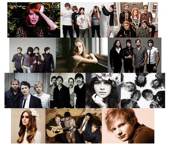
Music Magazine Mood Board
|
For my mood board I have collected images of both bands and artists who fit well into my chosen genre of 'Indie'. By using my own sources as well as the internet I have collected images of 'The Foals', 'Paramore', Florence and the Machine', 'Birdy' plus many more. For my magazine I will be using the inspiration and influence of the way these artists look, the colours included and the way they are presented for ideas when creating my magazine in the theme of this genre. The images that I have collected all show calm and peaceful colours which has inspired me to create my magazine using calm colours. I have also used the inspiration of the images for when I had my main image for the magazine to pose.
|
|
Target Audience
|
When also receiving my questionnaire results back I was able to decide on a chosen target audience for my music magazine. To ensure that my magazine linked well and was relevant to my target audience as well as the genre of the magazine. I must make sure that the price, the number of issues, the design and of course the information and imagery included is suitable and relevant for my magazine. The target audience that I have chosen to target my magazine at is teenagers between the ages of 15-18 years old. I have said why in my mind map to the right.
|
|
Gap In The Market
|
To encourage that my magazine would be successful and popular with its chosen target audience, I must ensure that the magazine is both appropriate and interesting to those between the ages of 15-18 years. I must make sure that the front cover as well as content of the magazine is eye catching and would beat any competitors whilst being on the newsstand with a number of different magazines. From my research and survey results I have been able to successfully choose a target audience and genre which I believe could fill a gap in the market.
|
|
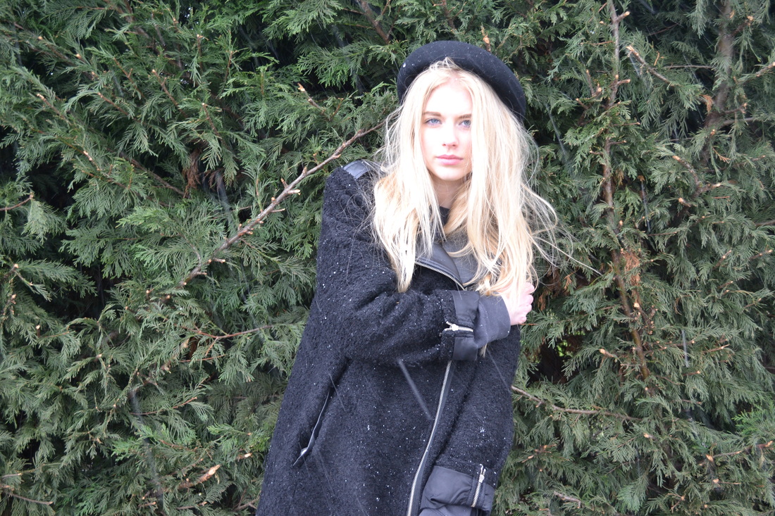
Photographs for Magazine
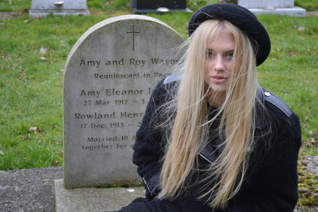
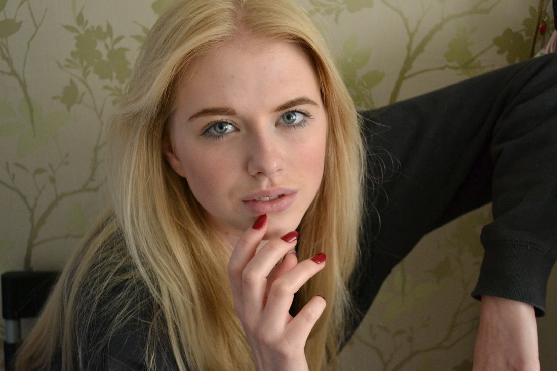
I have taken a couple of images for the front cover, contents page and double page spread for my magazine, at different angles to reach the right requirements. Below shows the three images which I had taken and chosen to use for my magazine of the musician 'Birdie Greene' who I created for my magazine.
|
|
|
Design of my Front Cover
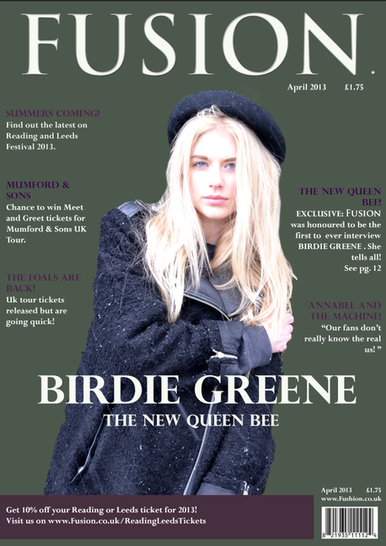
To the left shows an image of my front cover to my music magazine which I have created by using the software Photoshop. I have decided to name the magazine 'FUSION' due to the reason that I believe that it is original and creative as well as it links well into my genre of music and target audience. I have selected a clear and easy readable font (Trajan Pro) for the masthead which is located centrally at the top of the magazine. I have coloured this white (#ffffff) so that it stands out well from the dark olive green background (#4d584c). I have chosen this as my background colour as I believe that this colour suits well to my genre and is sophisticated, suitable for the target audience. It also links to the name of the main artist featured on the cover 'Birdie Greene' which shows a clear relevance of the meaning of the colour. Below the masthead I have also placed the magazine's monthly issue and the price which is where it will be most noticeable by customers looking at the magazine. I have also placed a copy of the issue date and the price at the bottom of the page, slightly above the barcode, ensuring that it is clearly noticeable, by the customer as well as the retailers. For the text written on the front cover, I have used the same three colours (white-#ffffff, light purple-#4d234c and dark purple-#3f1d4c) to create a simple however clear layout with the text which is easily read. I have coloured the subheadings which inform the readers on the main articles featured within the magazine differently from the rest of the text to ensure that they will stand out and will catch the viewer's eye. The fonts that I have used for this (Perpetua Titling MT-subheadings & Perpetua-text) are clearly readable and is suitable for the age range my magazine is targeted at. These subheadings are relevant to the magazine, holding articles, interviews and news & events that would be applicable as well as convenient to the target audience, genre and meaning of the magazine. For the main image I have used a photograph of a friend which I have taken myself, having her pose in a suitable position which is appropriate for the reason of the magazine as well as its target audience. I had her pose in a certain costume which I would believe to fit well for the genre of music my magazine has been produced for. I have written on top of the image 'BIRDIE GREENE' informing the readers of the main artist featured on the cover followed by 'THE NEW QUEEN BEE' which shows the readers a little insight of what the top article will be about. I have used a clear bold font again using a white colour to ensure that it stands out as this is a main part of the magazine, trying to catch readers attention to buy and read the magazine. At the bottom of the cover I have placed a banner which holds information on the Reading & Leeds Festival tickets as I believe this is a popular and well known event which is desired by teenagers who listen to 'Indie' music. The design of my front cover is very simple however I believe it is a good cover that is suitable for what my magazine has been produced for. Using my research of other magazine such as 'Q' and 'Billboard' has inspired me to create a simple layout, holding only one main image on the cover, as this is what attracts teenagers to buy and be interested in reading in on the magazine.
Design of my Contents Page
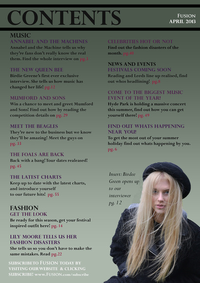
Shown to the left, for my contents page I have followed the colour scheme of the front cover for my magazine, to carry on with the idea of creating a special issue for the artist 'Birdie Greene' who is featured as the main image on the front cover including as exclusive interview with her on page 12. I had added a gradient affect onto the background which has created the colour to get lighter and lighter to finally fade out at the bottom of the page. I believe this gives the page a calmer affect as well as highlighting the mature affect to the page. I have named the contents page simply 'CONTENTS' to carry on with the mature and sophisticated layout suitable for the audience it is aimed at. I have then continued with the contents page with the layout of the text going down the page sectioning information into different sections such as Music, Fashion and News and Events. I have again, following my front cover, have used different sized and font texts to divide the subheadings from the rest of the test. I have done this by again using the light and dark purple colours as well as the font Perpetua Titling MT so that it stands out from the rest of the text which has been written in a size 14, font Perpetua and colour black. All the information I have included on the contents page is relevant to the magazine as well as the target audience. It highlights some of the most important pages inside the magazine that readers may wish to skip to and read. By each subheading, I have added a page number next to it which is highlighted from the rest of the text in a bright red colour (#981a3b) clearly telling the readers what page certain information is held on. Featured on the contents page, is also another image of my main artist 'Birdie Greene' which has been taken at the same shoot however at a different angle showing a slightly different image. This image has been used to carry on with the main article in the magazine, highlighting and reminding the readers. At the very bottom of the page, written in white to show a contrast between the information included on the page and to draw the readers attention to this information placed at the bottom, includes a piece of text informing the readers on subscribing to the magazine. This is a piece of advertisement for the magazine, informing the readers on buying the magazine on subscription encouraging the magazine to become more profitable. I have then placed the magazine's website at the bottom so that readers can read on, not just leaving the magazine once read, but then going onto the website to find out more. At the very top of the page, again in a white font, I have placed the magazine's name as well as issue date which is just a reminder to the readers whilst reading the magazine.
Design of my Double Page Spread
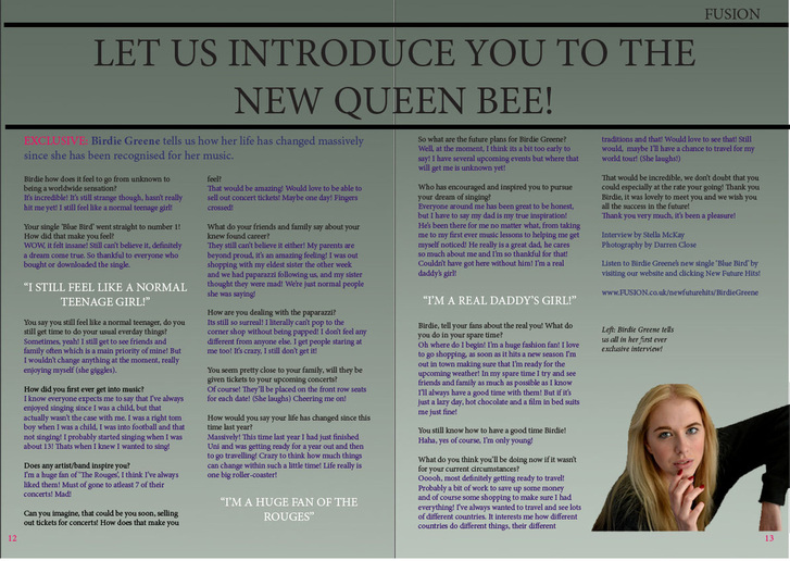
For my double page spread, I have written the article on the main feature of the issue, Birdie Greene. Following the theme, I have again highlighted the artist by using the gradient tool to create a green background that softens once it has gathered at the bottom. I gave the page the title 'LET US INTRODUCE YOU TO THE NEW QUEEN BEE' which continues from the front cover. For the subheading for the interview, I have started with 'EXCLUSIVE' written in a bright red font which grabs the readers attention from the very start. It then goes on telling the reader briefly what the interview below holds. Having 'exclusion' written at the beginning of the interview makes the readers aware of the special interview which is only held in this magazine. Below I have written the interview with the artist 'Birdie Greene', asking her relevant and interesting questions which fans/readers may be interested in hearing. I have tried to make it as exciting and enduring as possible to encourage the reader to want to read on. For the interview I have used 3 different looking texts to show the division between the question, answer and quotes. For the questions I have used the font Perpetua in a black colour so that they are clear and stand out well. For Birdie Greene's answers I have again used the font Perpetua however changed the colour to a dark purple to show the clear division. Between the interview I have placed some quotes which I have collected from the interview which I believe hold the most interesting and outstanding information. This I have coloured in white using the font Perpetua Titling MT which makes the text stand bold in capitals, making it stand out from the rest of the text. I have then placed an image at the bottom of the page which is relevant to the text and shows the readers what they are reading about visually. Beside it is a small insert of text which informs the reader what the image is showing, labelling Birdie Greene. At the very top of the page, is a small insert of the title 'FUSION' which has been typed in the masthead's original font Trajan Pro, to highlight it's signature look. To finish off the page, I have then placed the page numbers 12 & 13 at the bottom of each page which links to the front cover as well as the contents page, allowing readers to easily navigate around the magazine. I have again written this in a bright red font to ensure that it stands out clearly on the page, with it being at the bottom in the corner where the reader turns the page.
Magazine Review
To evaluate my magazine's front cover, contents page and double page spread, I have asked people who fit in with the magazine's chosen target audience to tell me what they like and dislike about my magazine, and if themselves would be interested in buying my magazine if it was published. I asked some students in my media class who are between the ages of 15-18 years old what they believe is successful about my magazine and what I could do to improve it. Mena, 16, said how she likes the way the magazine is simple and classy, fitting well into the genre of the theme. She also likes the way my model, and how she is dressed wearing a hat fits well to the genre of Indie, clearly highlighting what type of music the magazine is based on and targeted at. She also said that she likes the colour scheme I have chosen for my magazine and how the olive green background is creative and different from any other magazine on the market. To improve the magazine she said that she believed that I could add a couple more images as inserts onto my cover, contents and double page spread, to help to annotate the text further and as she believes that images are what draws her to buy a magazine. A lot of magazines in the market at the moment, clutter their pages with images as this is what attracts readers to buy their magazines. However this is what makes the magazine different from what is already on the market, simple but affective suitable for the target audience. Ella, 16, said that she believes that my magazine stretches out well to my target audience, with the images, stories and layout appropriate for their age group. She believes that the way my magazine has been represented suits well to my genre with it clearly showing the genre that it is devoted too. To improve my magazine she also believed that I could add more photographs to my magazine front cover, contents page and double page spread, which would be found interesting by my target audience. Richard, 17, said that he is very fond of the colour scheme of my magazine, saying that it links well to my target audience and is appealing to both males and females. He said that the simple layout is simple however effective, which shows clearly what sort of age group the magazine is targeted at. For improvements, there should be a little more text and images which are suitable for males rather than females, due to a lot of the stories on the front page aiming at the female audience. With the magazine having a female as the main image on the cover, also highlights the idea of it being targeted at the majority of females, encouraging the idea that the magazine should be improved to suit both genders better. By asking people from my target audience allows me to see how my magazine would do once published, allowing me to have an idea of what my audience would think of my magazine.
